
PROJECT REVIEW: Print Marketing Material
CLIENT: Wood-Ruff’s Supper Club
Client
Introduction:
Wood-Ruff’s Supper Club, located in Royal Oak, Michigan offers
exquisite food, an extensive wine selection and live music. Wood-Ruff’s
has earned an excellent reputation within the Royal Oak community by
providing: 1) a fine dinning experience; 2) friendly & entertaining
environment, and above all, 3) the unwavering commitment to satisfy
all guests by providing an eager & professional staff.
Preliminary
Assessment:
Wood-Ruff’s goal was to increase the utilization of their facility
and services other than regular supper and evening hours. Examples of
such banquets/special events currently offered include: Bridal/Baby
Showers, Rehearsal Dinners, Wedding Receptions, Bar & Bat Mitzvahs,
Graduation Parties, Confirmations, Baptisms, Retirements, Funerals,
Private Luncheons, Business Meetings, Award Ceremonies and other special
events.
At the time, Wood-Ruff’s had no official promotion material to positively impact potential clients and effectively assist the sales penetration desired by Management. The development and use of promotional aids during sales presentations and the implementation of promotional brochures would keep the “Wood-Ruff’s” name in front of potential, current, or past clients. This would facilitate new business and help retain previous business.
Project
Overview:
Target Audience: Potential Banquet &
Special Event Clients
Two different methods of target audience contact include:
Brochure: The brochure highlights banquet, special events and catering opportunities Wood-Ruff's has to offer for a variety of occasions. Brochures are available for Wood-Ruff's guests and distributed to local hotels, businesses, and community centers. The brochure is also great for a lasting impression after event booking presentations.
On-site Presentation Material: When assessing a potential client's needs and offering services, having the proper, organized material is imperative to successfully acquire new business. During the face-to-face, client-needs-assessment and client presentation, a master menu-like visual aid helps focus the sales presentation. This resource provides a variety of event options and examples while serving as a great reference tool.
Project
Goals:
- Greater community awareness and acknowledgement of Wood-Ruff's event
service opportunities
- Increased utilization of facility and staff beyond regular supper
hours
- Effective assistance for sales presentations to commit more clients
- Increased superior service-oriented image
- Greater communication and documentation
MARKETING DEVELOPMENT – Brochure Information and Layout
8 1/2 x 11 (100# Gloss Text Weight)
4color (front & back)
Aqueous Coating
Folding: Tri-Fold
Design
Appeal:
Developed a color scheme correlating with the restaurant's interior colors
CONTENT & LAYOUT
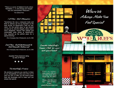
Panel 1 (the cover page) is used to grab attention and get the reader to open the brochure and see what is inside. If the front panel only displays your company name and logo, you will get disappointing results. With good brochure design, the front panel is an advertisement. Having this in mind, we used a benefit headline with a picture & graphics that is worth a thousand words. The greatest benefit Wood-Ruff's offers is represented in their slogan "Where We Always Make You Feel Special".
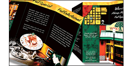
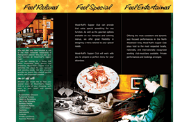
Panels
2, 3 and 4:
When the brochure is opened, the reader views the center spread - panels
2,3, and 4. We avoided strict adherence to columns. It could look cluttered,
boxy, and hard to read. We took full advantage of this space by spreading
across all three panels. The brochure's inside headline/benefits (Feel
Relaxed, Feel Special, Feel Entertained) cross over the three
panels. Photos and illustrations stretch as well. However, written copy
blocks do not cross the panels.
The most common mistake is trying to cram in too much text. We eliminated any text that did not effectively represent the brochure's purpose. We designed the brochure to be inviting and easy to read.
The center spread covers everything from the introduction to the first call for action. Benefits-benefits-benefits, excellent graphics, and a call to action will assure the effectiveness of any brochure. The center spread is a full-page, full-color, full-impact advertisement.
Panel
5:
This panel of the brochure was a good place for testimonials, third-party
endorsements and "The Wood-Ruff's Promise".
Panel
6:
Panel 6 emphasizes a call to action (Consider Wood-Ruff's
for your next special event!). We tell the reader exactly what
we want them to do (Visit us today) and tell them how
to do it. A location map was recommended for this panel. This way, the
event organizer could copy and distribute with invitations. Our goal was
to make it as easy as possible to find and contact the restaurant. A custom,
high quality map was integrated on this panel, adopting the design style
and color scheme of the brochure.
Services Overview:
- Copywriting - Brochure Marketing / Sales Copy
- Brochure Layout & Design
- Prepress file preparation
- Research