PROJECT REVIEW: Identity Development
CLIENT: KiTARO - bistro of japan

Client
Introduction:
Foundation and Mission of KiTARO - bistro of japan:
-
To provide a unique and satisfying dining experience
- To provide a contemporary atmosphere with authentic cuisine
- Attentive service - Reasonably priced meals
- Specialties include Japanese steak, seafood and sushi
- Offering lunch and dinner menus
- Offering full liquor bar and sushi bar
- Attracting both the business crowd and affluent residents
Project
Overview:
bdHarman Productions was contracted to develop an Identity
Program for KiTARO – bistro of japan, a new restaurant
planning to open April 2007. This O'Fallon, Missouri Japanese steakhouse and sushi bar was envisioned to break away from the traditional Japanese image and
style. A more contemporary identity was needed to comply with area’s
demographics and attract their target market. The identity program required contemporary appeal, but also complement architectural
style and building materials planned for the restaurant.
IDENTITY DEVELOPMENT – logo creation and branding development
Logo
Creation:
Design
Logic
- Contemporary and Modern, but Authentic
- Classy, but Entertaining
- New, but Confident
Color
Logic
BLACK
- Formal, rich, elegant, serious, distinctiveness, boldness, authority,
practicality and a corporate mentality
- Black denotes strength and authority; it is considered to be a very
formal, elegant, and prestigious color
- Black gives the feeling of perspective and depth
- Combined with red (a very powerful color) - black gives a very aggressive
color scheme.
RED
- Aggressive, assertive, intense, strength, vitality, life-sustaining,
passionate, courageous, insightful
- Red is the hottest of all colors, and as such, represents all things
intense and passionate.
- Red makes an excellent accent color, particularly when used with neutral
colors (black and gray).
- Red brings text and images to the foreground.
- Red is used to grab attention and to get people to take action.
- Red is used to suggest speed combined with confidence.
Branding
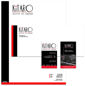
Development: Developed a set color scheme and style for all marketing
materials.
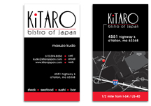
 Business
Cards:
Design - Designed in compliance with adopted
color scheme and style
Printing - High-quality, 4-Color front /
back process printing on 120# Gloss Cover Stock with Aqueous Coating

Stationery:
Design – Designed in compliance with
adopted color scheme and style
Printing – High-quality, 4-Color process
printing on Classic Crest Super Smooth Paper
Services Overview:
- Business Identity
- Branding Development
- Prepress file preparation and printing
- Market Research